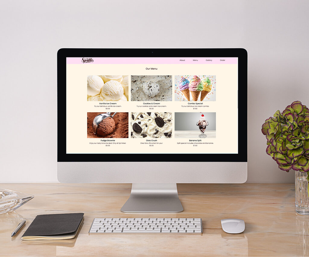
Sprinkles Website
For this project, I designed a website for a fictitious company called Sprinkles. The goal was to develop a homepage layout that felt light, airy, and inviting. I chose a color palette that conveyed a clean and refreshing tone. This website was coded from scratch in Adobe Dreamweaver using HTML and CSS, providing me with hands-on experience in both design and web development.
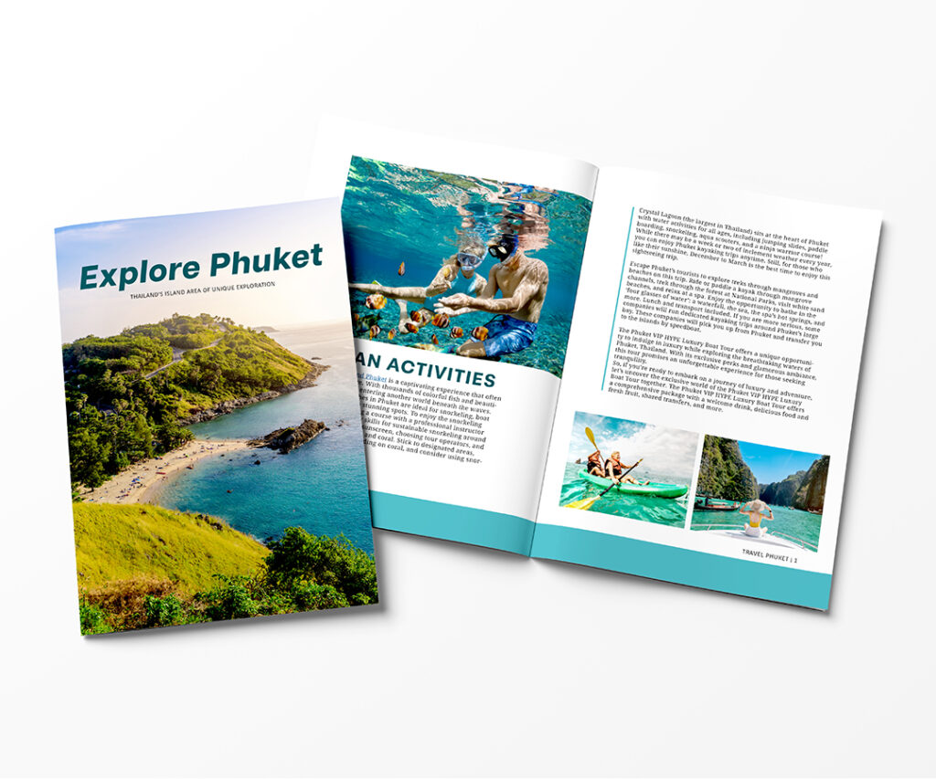
Travel Magazine
For this project, I used Adobe InDesign to create a 12-page, saddle-stitched magazine promoting Phuket, a travel destination. The design incorporated varied imagery, colors, and fonts. After researching, I developed a blue and gray color palette to reflect tranquility and an airy feel, paired with an appropriate, readable serif font. I wanted the serif font to contrast nicely with the sans-serif headings.
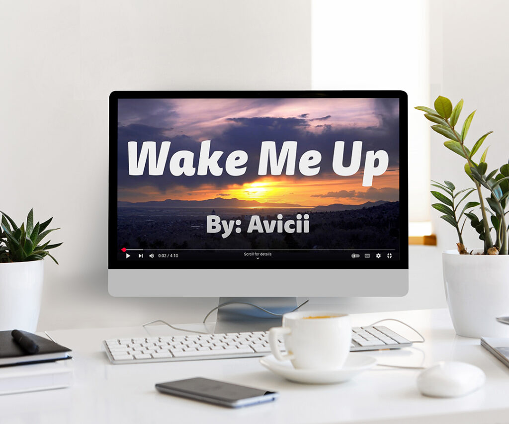
Lyric Video
I had the opportunity to gain more After Effects experience by designing a lyric video. I chose the song and created a lyric video using the lyrics, creative fonts, animation, and video clips. I wanted the video clips to add a sense of emotion and make viewers feel impacted. This project gave me good experience with Adobe After Effects! The full video can be found on our program’s YouTube page!
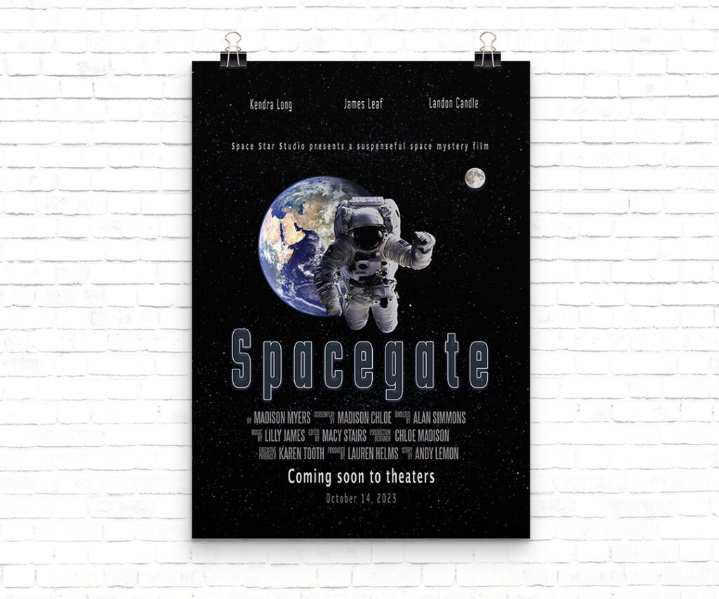
Movie Poster
In my first semester, I designed a movie poster in Adobe Photoshop, following specific guidelines for document setup and title names. This project encouraged me to step out of my comfort zone, utilizing Photoshop’s extensive toolset to create a compelling, visually striking design. I applied design principles effectively to craft a layout that captured the essence of the movie’s theme.
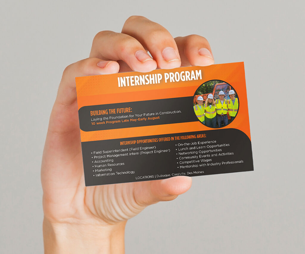
Rack Card
Further into my internship at Conlon Construction, I designed a rack card to showcase the company’s services. Using Adobe InDesign, I crafted an engaging layout that adhered to their branding guidelines, incorporating their color scheme and fonts. This project deepened my understanding of maintaining a cohesive and professional brand identity in marketing materials.
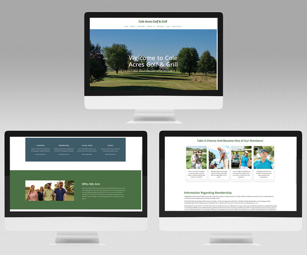
Client Website
In my third semester, I had the opportunity to redesign a website for Cole Acres Golf & Grill, a local golf course in my hometown of Cuba City. This project involved modernizing their website using WordPress, allowing me to reflect the company’s brand. WordPress helped me design faster, giving me a good experience using its helpful features. It gave me good real-world experience!
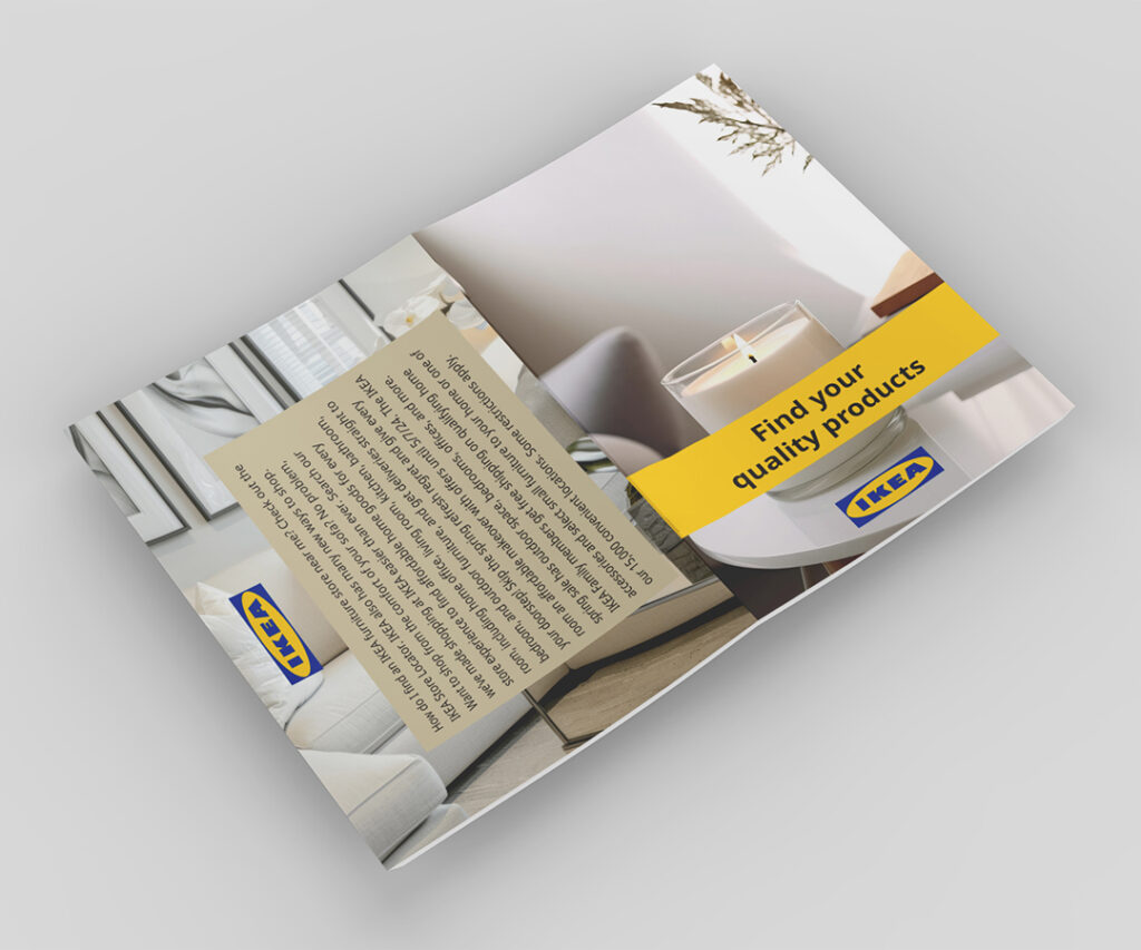
Product Guide
In my second semester, I created a product guide using Adobe InDesign. I selected Ikea from a list of companies and conducted thorough research into their brand identity, including fonts, colors, and imagery. The goal was to resemble a brochure with a clean, structured layout featuring four distinct sections that visually unified the Ikea brand. It gave me insight into the importance of branding.
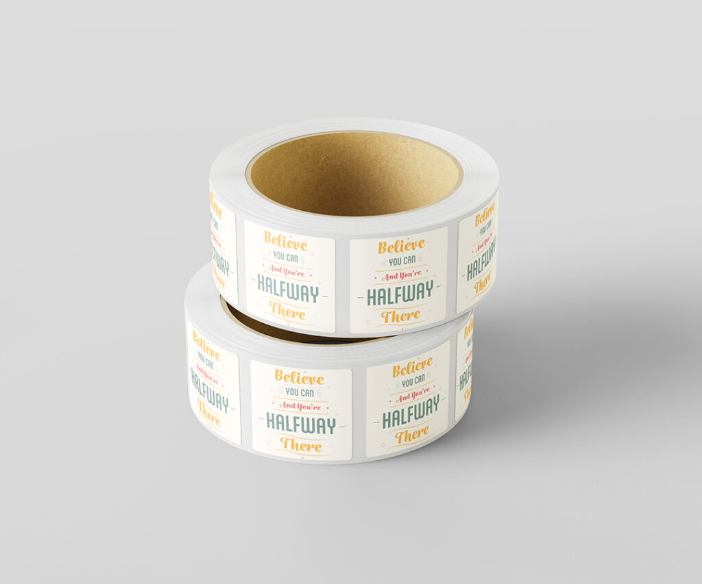
Die-Cut Sticker
For this project, I designed a die-cut sticker using Adobe Illustrator featuring a motivational quote that I’m passionate about. I experimented with various fonts and layouts to ensure the message was impactful and visually engaging. The project taught me valuable skills in preparing artwork for print and working with die-cut designs to bring a unique, motivational quote to life.
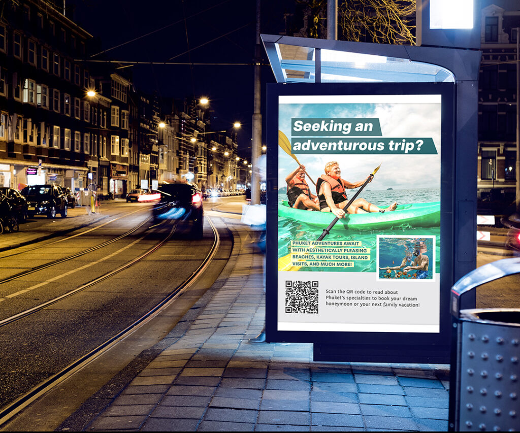
Travel Magazine Ad
Building on my previous magazine project, I designed an advertisement using Adobe InDesign to promote the same travel destination. I used the same fonts and colors to maintain visual consistency and branding. I incorporated an image I felt would help the ad stand out. The ad was developed in various sizes, including a web banner, full-page and half-page print ads, and multiple social media formats.
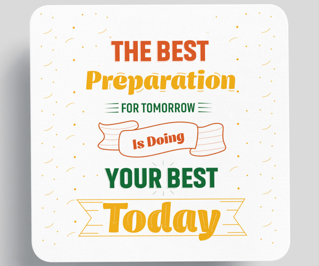
Magnet Design
This semester, I had the opportunity to further develop my typography skills through a project focused on creating a design for a vinyl magnet. The goal was to select an inspirational quote and design it in Adobe Illustrator. I incorporated distinctive elements to make the design stand out, enhancing its boldness and creativity. I added a pattern to make it stand out and feel fun!
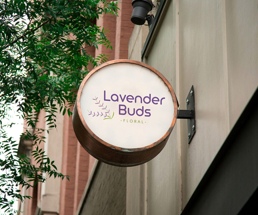
Logo Design & Animation
This project had two parts: designing a logo and animating it. The client asked me to create a logo for a fictitious company of our choice using Adobe Illustrator and later animate it using Adobe After Effects to see how the logo works in motion. I provided the logo on a mockup to see how it would look if displayed in a real-life setting. You can find the whole animation on our YouTube page.
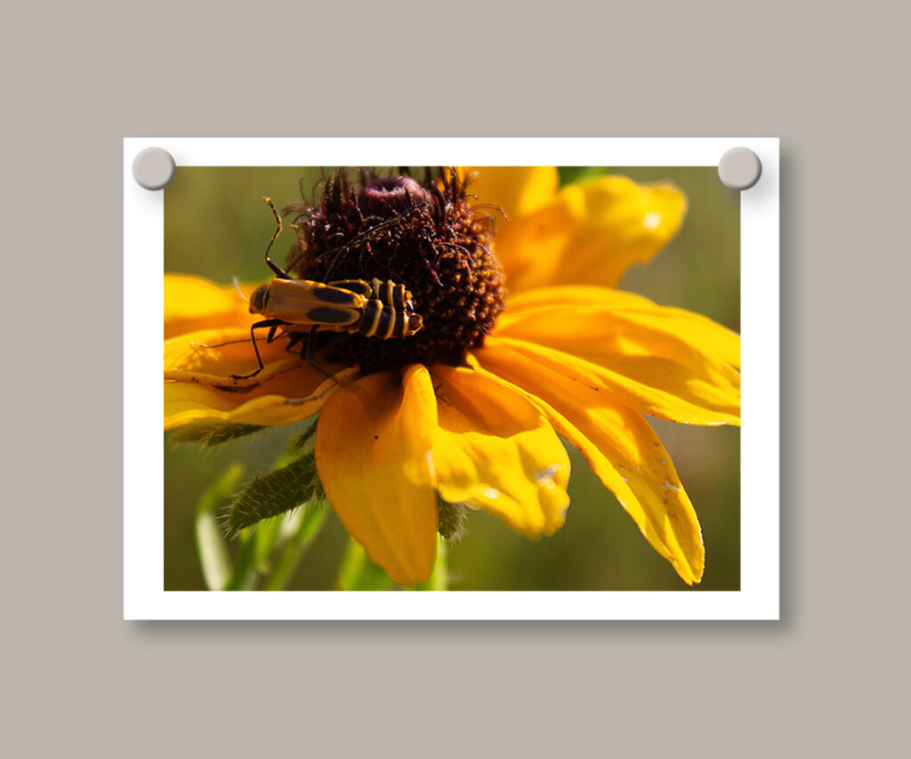
Photography
In my Digital Photography class, I had the opportunity to develop my camera skills and work on a final project with a specific theme. I chose “nature” as my focus, capturing a range of images that emphasized the beauty of the natural world. Through careful cropping and editing in Adobe Lightroom, I incorporated the rule of thirds, creating a cohesive and visually engaging collection.